From time immemorial colors have been used by artists to put out their abstract thoughts and feelings in front of others. At the same time, they have also been used as something that can get the attention of people. “Color is a power that indirectly influences the soul,” said the great Russian painter Wassily Kandinsky. But as the developments in the field of psychology happened, researchers realised the impacts of colors on human psychology as well as on their decisions.
Color psychology has been greatly studied and used in fields such as interior design, product design, advertising and much more. As a famous example, once the popular ketchup brand HEINZ made changes in the color of their signature ketchup from red to green. HEINZ sold nearly 10 million bottles of ketchup in the next 7 months after that, garnering a revenue of $ 23 million from that sales figure. But things took an unexpected turn when HEINZ decided to sell their ketchup in various colors such as purple, pink and orange. This had a disastrous impact on the sales number.
That is why it is very important to understand color psychology as it can have a boosting or busting effect on your end goal.
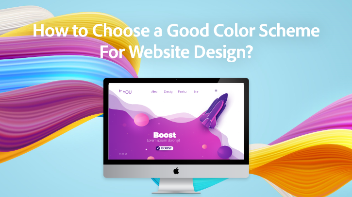
What is Color Psychology?
Going by the generally accepted definition, color psychology is the study of various color palettes and their effects on a person. Colors are said to change the perceptions of people toward objects. Several studies have found that people make assumptions about a new dish depending on its color and texture. Similarly, in the medical field colors have been used as placebos to enhance the effectiveness of medicines.
However, the marketing and designing fields take much greater benefits of color psychology than any other field. With the increase in competition among businesses in the digital space, it has become an important thing to pay attention to the visual aspect of the website. According to the Design Advisor, it just takes 90 seconds for a person to make a product assessment. Additionally, 62 to 90 per cent of the decision is based solely on the colors of a product.
A website acts as a digital outlet and an advertisement for the organisation at the same time. Thus it is crucial to leverage the concept of color psychology to increase the flow of visitors to the website.
Color Psychology In Web Design
The use of a correct color pallet can create a soothing effect on the user, conversely, it can also cause a straining effect on the eyes. Picking the website color is a matter of importance and depends on various factors such as
- Type of business
- The Audience
- Age group
- Gender
There can be much more classifications in addition to the above-mentioned factors. For example, if we compare two very different content sites like Buzzfeed and TIME, you would instantly notice the change in color and design choice. This is due to the difference in the content type and the targeted audience.
However, even if we compare the web design of two businesses working in the same industry, there is a significant difference in the choice of color scheme for Website. This difference is what makes a brand stand out from the other and can even become a symbol representing the business. Further, the usage of certain colors on the call to action can increase the chances of clicks and later higher conversion figures.
While picking the website color a designer has to pay attention to a lot of things, among them the concept of color pallets holds a prominent place. Color Pallets can be commonly bifurcated into the following categories.
- Monochromatic – As its name suggests, only a single color is used in the design process with different contrast to maintain consistency.
- Analogues – The Analogues pallets use the colors which are next to each other on the color wheel and provide a similar color trend within the web page.
- Complementary – When the color scheme for a website contains two different sections which require a different feel, then the complementary color pallet is used. The pallets use two opposite colors on the color wheel to create this effect.
- Split Complementary – The split complementary pallet uses the same concept as the complimentary pallet but instead of just 1 opposite color, it uses two opposite colors on the wheel.
- Triadic – The triadic pallet concept uses three colors that have even space between them on the color wheel. Although, it is important to maintain consistency while using the triadic palette for color in web design.
- Tetradic – Tetradic or rectangle color pallet uses four colors from the color wheel that are equally spaced out. This pallet is usually used when there is a need for diversity in color in web design.
User Experience and Accessibility
Apart from the marketing purpose color psychology in web design is also important to enhance the user experience and the accessibility of the website. It is important to ensure that the color scheme of the website does not hinder readability in any way. There is a reason why the popular social media website Facebook uses blue as its base color. Founder of Facebook, Mark Zuckerberg is said to be red-green colorblind and finds it hard to see these colors. That is why before looking into the aesthetic part of the website, a simple user experience must be seen as the top priority while choosing the best color combinations for websites.
Impact of Different colors
Our brain works with a comparison and relation mechanism to predict the effect and outcome of various things. For the same reason, a majority of people connect certain colors with various emotions. These effects can vary according to culture, geographies and experience. Understanding the impact of various colors can help a designer to avail greater benefits from color psychology.
* Red
Red is one of the most vibrant colors only behind the yellow color. Popularly it is used to represent power, love, danger and excitement. When it comes to emotions, the red color is representative of anger and often used to portray aggression and dominance.
* Yellow
Yellow is more seen as a vibrant and casual color representing the emotions of happiness and enthusiasm. While yellow gives a warm effect to the eyes, if your website has higher traffic at night time, then it is a good idea to choose some cool colors other than yellow.
* Blue
Due to its association with the sky and water, the blue color is often seen to have a calm and cooling effect. If perceived gender wise, blue is highly preferred by men. Though darker shades of blue represent sadness or melancholy and should be carefully used in case of casual content websites.
* Green
Green provides a protective ambience to the website due to its association with nature. A green pallet is kind of unique in the sense that it has both a calming and energetic effect on the viewer. But it also negatively affects the readability factor when used as a text color.
Just like the number of colors, their effects on moods are also unlimited. That is why it is important to know how to choose the right color for the right setting.
Tips to Choose the Right Colors
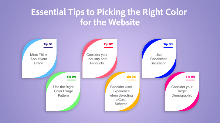
- Reconcile Brand Image and Color Scheme
While choosing the right color for your website design, it is crucial to reconcile both the visual approach of the brand and the website. As a popular example, the E-commerce giant Amazon follows a consistent color pattern on its website, mobile app and logo. This helps in leaving a long-lasting impression on the visitor’s mind
- Choosing the right proportion for Colors
If a website is going to use multiple colors, the proportion of colors should be decided in advance by the designer by paying close attention to factors like readability. An old designer rule called the 60-30-10 rule mentions that when using a triadic color pattern it is optimum to divide the three colors into proportions of 60%, 30% and 10% respectively.
- Audience based color scheme
At the end of the day, every design and marketing tactic is aimed at entertaining the current audience and gaining new ones. However, while choosing a color pattern it is important to consider factors like the demographics, gender or occupation of the audience. This can also be done by consulting a web design expert with decent experience of designing websites for a wide range of audience.
- Identify Focus Points
While incorporating new color schemes and design, identify the main focus points. Giving equal importance to all the elements may fail to direct the visitor’s attention toward elements like CTA buttons. Hence the color patterns should be used in a way that they highlight the end goal of the website in front of the visitors.
- Consider Industry Standards
Every industry has its own way of doing things. Companies working in the fashion industry and construction industry have quite different design and color tastes. While it is important for a website to position itself uniquely, it should also focus on keeping the color scheme consistent with the industry standards and consumer preferences.
Reading Recommended The Most Comprehensive Guide to Web Application Development in 2021
Understanding color psychology stops you from making those impulsive decisions regarding web design. Though the color schemes are changeable, it is not a good idea to do so frequently as it doesn’t let the users form a proper image of the brand in their minds. Having web design services from an expert website design company can efficiently mitigate this problem. Consulting Whiz has been doing website development company in USA for years now. Due to our class apart web design services, Consulting Whiz has been able to garner a significant client base all over the world. Comprising highly experienced web designers and developers, we offer the best web development services helping you to have a faster and beautiful website. Discuss your project and understand your requirements with an expert in color psychology and web design now.


Mike is the founder of ConsultingWhiz LLC, Software development company in the USA, he has 15+ years of experience in agile technologies and development. I’ve worked with many satisfied owners of customer servicing businesses. Let’s connect today to get started on your path to 100% automation, reduced overhead costs, large ROI, and so much more.

 Mobile App development
 Web Development
 Custom Software Development
 Iot Development
 949 656 9676
 contact@consultingwhiz.com